Way back in 2011, I made all my mistakes on that first cover of the first edition of my first novel "DANCING IN THE SHADOW OF LOVE." The end result was nothing like I wanted it to be.
I loved my second cover, designed by a professional in 2012. But, as beautiful and unusual as it is, it still wasn't quite right for the book: it sent the wrong message to readers. This novel is not a romance novel, but a hard-hitting, gritty spiritual allegory.
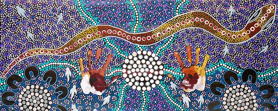
In 2018, I decided to try again. I returned to the beginning. The artwork of my 2011 and 2018 covers is a mixed media painting by South African artist, Martin Wenkidu. Called "Man and the World of Stars" it - like the novel - is dense with symbolism. You can read an interview with the artist here, where he explains the imagery and symbolism. This image resonates deeply with the content of the novel: the three figures in the dance of life, arms upraised to connect to the Divine, coming out of the shadows and into the light of Love.

Third time lucky! Using the original artwork, Wendy from Apple Pie Graphics did a stunning job on the cover. Now I feel this book is finally complete and I can close the chapter on it. What a relief!


6 comments:
It's perfect!
Thanks Linda - and it's lovely to be in touch again! Hope your writing going well! :)
Hi Judy - I loved the earlier cover ... but this improves it - love the image ... take care ... while the story was so interesting to read - it needs to happen again - i.e. I need to re-read it ... when I get back and settled in England. Take care and with love Hilary
Hilary - thank you! Yes you are correct, as good as the otehr cover was, this cover is an improvement because it's a more accurate reflection of the story. Hope you're enjoying your travels! :)
Yes! I loved the figures on the first cover, but darkening the background... that really makes it POP!
Thanks Bish! Apologies for delay in replying - your comment went into spam and I've only picked it up now. Hope you're keeping well & your writing is smooth and easy!
Post a Comment